Placido Gómez, PapelerÃa LibrerÃa
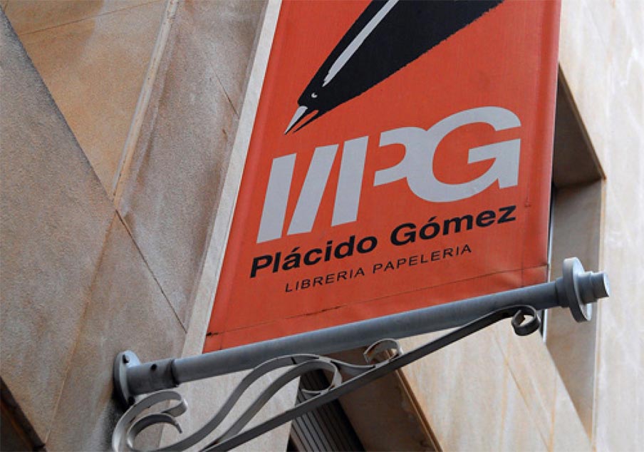
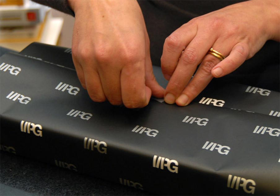
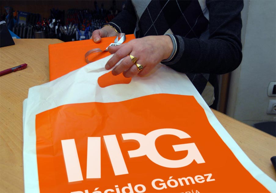
Following the main aim of highlighting the well-known stationery shop, had also become a bookseller and, based on a survey and opinion research, we proposed the need to redirect the brand towards a more up-to-date business model without losing its centenary history. First of all, the visual identity was changed. We went from an already outdated dark maroon logo - with the name of the founder in classic typography - to a young and vibrant orange. It allowed us to go from a patronymic logo to a symbol-logo incorporating book spines on a shelf and the initials of the name in sans-serif typography, thus creating a more modern and industrial logo than the old one. All types of communication media were also designed: bags, wrapping paper, outdoor signs, bookmarks, interior signage, company vehicles signage, etc.
Título
Placido Gómez - Stationery Shop
Cliente
Plácido Gómez
Año
2006


